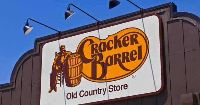
Cracker Barrel rolled out a new logo, and yes—it’s bad. Flat, forgettable, the kind of “modern” mark that could belong to a 1970s cheese brand or a generic grocery aisle. But the pearl-clutching over it? Even funnier. The market shaved nearly $200 million off the company’s value, headlines screamed, and suddenly a set of curves and kerning became the end of an American institution. Come on.
Here’s the real story: the pixels aren’t the problem, the vibe is. Longtime road-trippers say the dining rooms are going white and sterile, the menu is thinner, prices higher, and the once-distinct roadside museum feel is getting sanded down. If your whole brand is warm, folksy nostalgia, you don’t go minimalist and antiseptic—you double down on it. A new logo won’t lure the people who never stopped; better biscuits, better service, and that cluttered-on-purpose charm will.
So yes, the logo misfires. But the bigger miss is mistaking identity for a file in a brand folder. Will they snap back to the old look? Tick, tick, tick…